Landing pages
Landing page offer not converting? It's not your design
A landing page offer not converting is rarely a design problem — after building 600+ pages, the pattern is hard to ignore. The pages that don't convert almost always have the same root cause, and it isn't the font, the colour, or the layout. It's what they're asking the visitor to do.
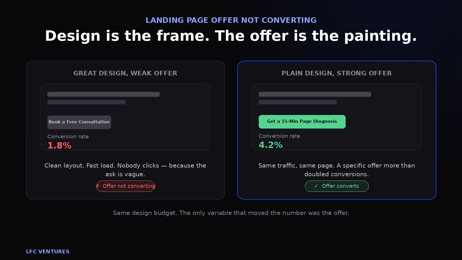
A founder comes to us and says "my landing page isn't converting, I need a redesign." We open the page. The design is fine — clean layout, readable text, mobile-friendly, loads fast. The problem is the big blue button in the middle of the screen that says "Book a Free Consultation."
That's not a design problem. That's an offer problem. And no amount of redesigning, re-colouring or re-animating will fix it, because the visitor is looking at the button and thinking: "Why would I give you thirty minutes of my time when I don't even know if you can help me?"
This is the conversation nobody wants to have, because it means the issue isn't something a designer can fix in a week. It means rethinking what you're asking strangers to do — which is harder, more uncomfortable, and more valuable than any visual change.
If you've searched for why your landing page offer is not converting and landed on ten articles about button colours and hero images, this one is different. The fix almost never lives in the design layer.
The pattern across 600 pages
We've built over 600 landing pages across India, Australia and Germany. After that volume, certain patterns stop being coincidences and start being rules. Here's the most consistent one:
Pages with strong offers and mediocre design consistently outperform pages with weak offers and excellent design.
We've tested this directly. We've taken a client's beautifully designed page that converts at 1.8% and replaced it with a simpler page — same traffic, same audience — with a stronger offer. The simpler page converts at 4.2%. We've done the reverse too: taken a strong offer on a plain page and given it premium design. Conversion improved marginally, from 4.2% to 4.7%.
The lesson: the offer is worth 2–3x the design. Design matters — it carries credibility, trust and professionalism. But it's a multiplier, not a foundation. A multiplier applied to zero is still zero. This lines up with what larger-scale conversion research has found too: Baymard Institute's usability studies consistently show that clarity of the ask outweighs visual polish once a page clears a basic usability bar.
So when a client tells us their landing page offer is not converting, the first thing we look at is never the colour palette — it's the sentence next to the button.
Design is the frame. The offer is the painting. Nobody buys a frame.
What an offer actually is
An offer is not your product or service. It's the specific thing you're asking a stranger to do right now, and what they get in return for doing it.
Most businesses confuse three things:
| What it is | Example | What it does |
|---|---|---|
| The service | "We build landing pages" | Describes what you do (category) |
| The proposition | "Pages that turn ad clicks into booked calls" | Describes the value (why they should care) |
| The offer | "Get a 15-minute diagnosis of why your page isn't converting, with a written summary you keep either way" | Describes the next step (what they actually do) |
The service belongs on your website. The proposition belongs in your headline. The offer belongs on the button. Most pages put the service everywhere and the offer nowhere — which is why the button says "Contact Us" and nobody clicks it.
Is your landing page offer not converting? Five signs to check
You don't need analytics to diagnose this. If your landing page offer is not converting, one of these five reasons is almost always why — ask yourself these five questions honestly:
- "Book a free consultation" is your entire CTA. A consultation is a request for someone's time, and time is more expensive than money for most business owners. If the only thing you're offering is "talk to us," you're asking for the most valuable thing a stranger has, before proving you deserve it. The visitor is thinking: what if it's a sales pitch? What if they can't help? That uncertainty costs you clicks.
- You can't explain in one sentence what the visitor gets. If it takes you a paragraph to describe what happens after someone clicks your button, the offer is too vague. "A 15-minute page diagnosis with a written summary" is one sentence. "An initial discovery session to explore how we might be able to help you achieve your business goals" is a sentence that says nothing.
- Your competitor could put the same offer on their page. "Free consultation" is available from every agency, clinic and coaching business on the internet. If your offer is identical to everyone else's, you haven't given someone a reason to choose you. The offer needs to be specific to what you uniquely do well.
- There's no outcome attached. "Book a call" describes a format. "Find out exactly why your page isn't converting, in 15 minutes" describes an outcome. The format is the cost (your time). The outcome is the benefit (an answer). If you only communicate the cost, nobody's buying.
- The risk is entirely on the visitor. They give you their name, phone number, and thirty minutes. What do they get if it turns out you can't help? Nothing. The risk is 100% theirs. A strong offer redistributes that risk: "you keep the written summary either way" means they get value regardless of whether they hire you. That changes the calculus entirely.
Read your CTA button text to a friend who doesn't know your business. Ask them: "would you click this?" If they hesitate or ask "what do I get?" — the offer is weak. If they say "yeah, obviously" — the offer is strong enough.
How to fix it before you redesign
You don't need a new page. You need a new first step. Here's the framework we use whenever a landing page offer is not converting and the client's first instinct is to blame the design.
Step 1: Lower the commitment
The smaller the first step, the more people take it. "Book a 45-minute consultation" is a big ask. "Get a 10-minute diagnosis" is smaller. "Download the checklist" is smaller still. "Answer three questions and see your score" is the smallest. Start with the smallest step that still qualifies the lead enough to be useful to you. This is essentially the "micro-commitment" principle Nielsen Norman Group has written about in the context of persuasive UX — smaller first steps lower the perceived risk of saying yes.
Step 2: Name the outcome, not the format
Replace every "consultation," "discovery call," and "meeting" with what actually happens during that thing. Nobody wants a consultation. They want to know why their page isn't working, how much a landing page should cost, or whether their ad spend is being wasted. Name the answer, not the meeting.
Step 3: Remove the risk
Add a guarantee or a keep-it-either-way component. "You keep the written summary whether you hire us or not." "If we can't find at least three things to fix, the audit is free." "₹199 deposit, applied in full to the project if you proceed." Each of these shifts risk from the visitor to you — and that shift is what makes someone who's 60% convinced click the button.
Step 4: Make it specific to you
"Free consultation" could be anyone. "A 15-minute walkthrough of our 30-point conversion framework, applied to your specific page" can only be you. Specificity creates ownership. If your offer names your framework, your method or your tool, it can't be copied by pasting it onto a competitor's page.
Want help rebuilding the offer?
We diagnose the offer before we touch the page — because the strongest design in the world can't sell a weak ask. Tell us what you're selling and we'll tell you what the first step should be.
Get an offer diagnosis →Weak vs strong: real examples
These are before-and-after versions from pages we've worked on. The businesses are anonymised but the offers are real.
| Industry | Weak offer | Strong offer |
|---|---|---|
| Dental clinic | "Book an appointment" | "Check available slots and book in 30 seconds — no phone call needed" |
| Marketing agency | "Schedule a free consultation" | "Get a 15-minute page diagnosis with a written summary you keep either way" |
| Coaching business | "Contact us to learn more" | "Answer 4 questions and see which programme fits your situation — takes 60 seconds" |
| Construction company | "Request a quote" | "Upload your plans and get a ballpark range within 24 hours — no site visit needed yet" |
| D2C skincare | "Shop now" | "Take the 2-minute skin quiz and get a personalised routine — free samples ship tomorrow" |
| SaaS product | "Start your free trial" | "See your own data in the dashboard in 3 minutes — no credit card, no setup call" |
Every strong offer in that table does three things the weak one doesn't: it names what the visitor gets, it tells them how long it takes, and it removes the most obvious objection. Those three components turn a generic CTA into a specific reason to act now.
Common questions
What if I sell something expensive and the commitment has to be high?
It doesn't have to be. Even for ₹10 lakh services, the first step can be small. A construction company doesn't need to book a site visit as step one — they can upload plans and get a ballpark first. A B2B SaaS doesn't need a demo call as step one — they can see sample data in 3 minutes. The sale can be high-commitment. The first step can't be.
Won't a lower-commitment offer attract lower-quality leads?
Sometimes, but the math usually wins. A "free consultation" that gets 2 enquiries a week generates 2 leads. A "15-minute diagnosis" that gets 8 enquiries a week, even if 3 are unqualified, generates 5 qualified leads. You're better off qualifying more people in than filtering everyone out. A short qualifying question in the form handles the rest.
Is "Book a free consultation" always wrong?
No — it works when the visitor already has high intent. If someone Googles "landing page agency India" and lands on your page, they're already looking for what you sell. The generic CTA is fine because the intent is doing the work. But if you're running Meta ads to cold audiences, "free consultation" is asking a stranger for a commitment they're not ready for. Match the offer to the audience's temperature.
How do I know if the problem is the offer or the page?
Change the offer without changing anything else. Keep the same page, same design, same traffic. Just swap the CTA and the supporting text around it. If conversion rate moves significantly, it was the offer. If it doesn't, now you know it's the page. We cover the full diagnostic process in our post on diagnosing whether it's the ads or the page.
Can the offer be too good? Will people think it's a scam?
In India, yes — this is a real concern. If the offer looks too generous without explanation, Indian buyers become suspicious rather than excited. The fix is to explain why you're offering it. "We do this because we know that once you see the diagnosis, you'll understand what we do better than any sales pitch could explain" is transparent and believable. Unexplained generosity triggers distrust. Explained generosity triggers curiosity.
Rohit Bhatt
Founder, LFC VenturesRohit diagnoses the offer before touching the design on every page LFC Ventures builds. The weak-vs-strong examples in this post are from real client projects.